D’ALBERTO & GRAHAM Attorneys & Law
Agency: Blue Ion
Services: Art Direction, Brand Identity, Print Collateral, WEB DESIGN
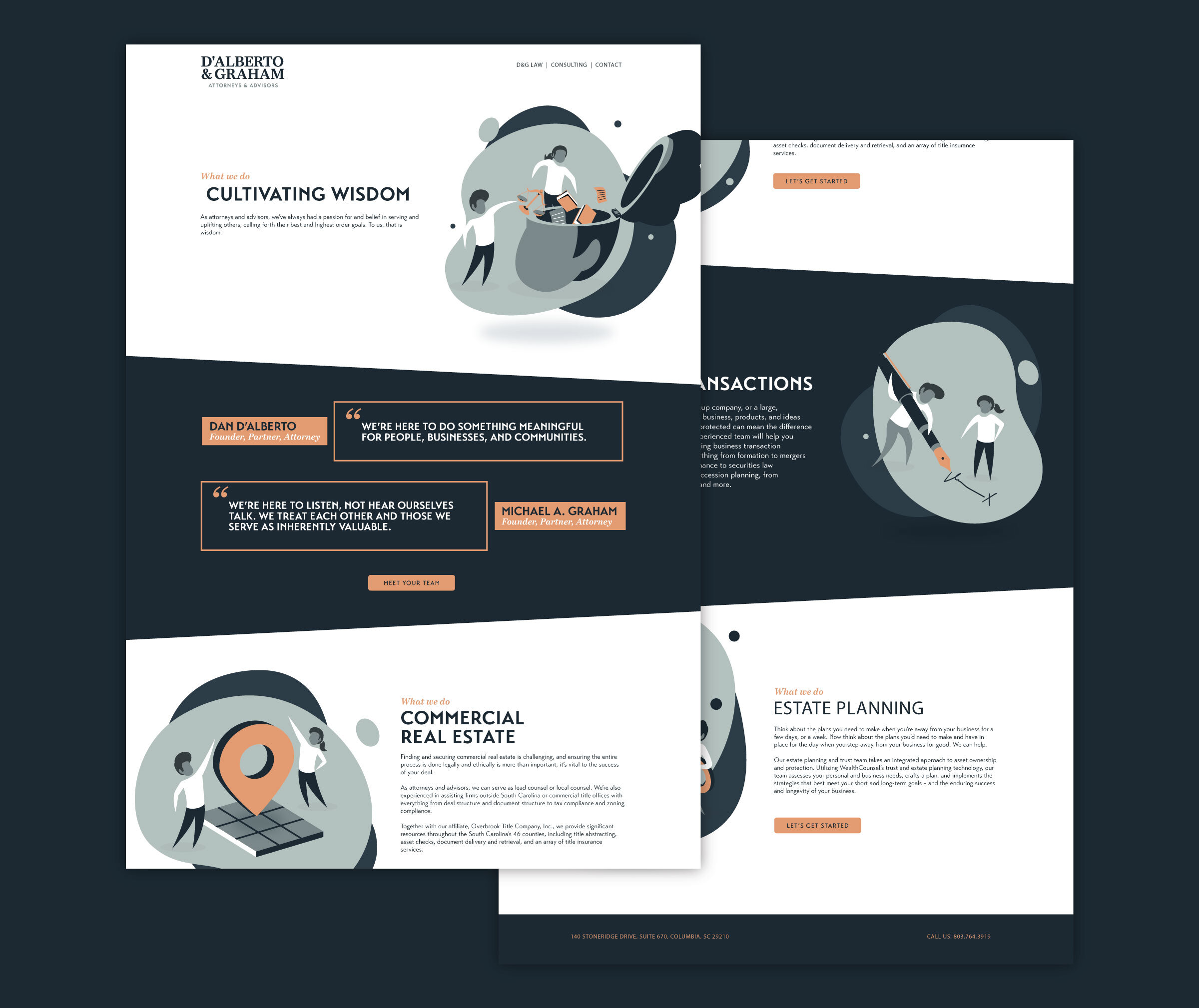
While working at Blue Ion, I was tasked with developing an Identity and a immersive web experience for D’Alberto & Graham Attorneys & Law, a law and consulting firm that is dedicated to serving and uplifting their clients. To do this, I designed a custom illustration that helped explain each service. I worked alongside programmers to then help bring these services to life in a subtle yet interactive way with engaging HTML animations.
DISCOVERY & EXPLORATION
For this project, the client needed help with developing a brand and visual system that would give their services and work the visual representation that it needed. The problem that we faced involved, clearly communicating the services in a visually engaging way that wasn't confusing and gave the brand its equity.
The wordmark for D’Alberto & Graham Attorneys & Law was chosen based on its potential use alongside other affiliated brands. I knew that this wordmark would be apart of a large system that involves Grey Fox(a secondary affiliated brand) which would use a complexed icon and modern execution. Due to these two brands being used alongside each other and apart of the same company. The challenge became, how to develop an appropriate contrast between the two brands but still keep them similar enough to remain underneath the same umbrella. The shared color palette was another aspect that helped bring the two brands together. While the Seif wordmark became a simple approach for D’Alberto & Graham Attorneys & Law to remain sophisticated and clear.
PROJECT TYPE
COLLABORATION WITH COPY DIRECTOR, WEB DEVELOPER, AND PROJECT MANAGER
TIMELINE
Apr - AUG 2019 (16 WEEKS)
PROCESS OVERVIEW
The introduction of the editorial illustrations helped bring a unique and fun aspect to the D’Alberto & Graham Attorneys & Law brand. By developing a system of illustrations that helped explain the brand and services, the website experience was able to bring understanding and value to the content that was being displayed. The minimalist editorial style that was approved by the client, allowed for a fun and engaging illustration to be depicted and later animated for the website experience.
WEBSITE DEVELOPMENT
During this task, we were able to bring subtle animations to the overall web experience. I worked alongside the lead programmer, as we brought each animation to life with HTML. The final design was a smooth and engaging experience that informed each user on the different services offered at D’Alberto & Graham Attorneys & Law.
Subtile animation through mobile scrolling.
The animated illustrations were also designed to be scalable at mobile screen sizes.
animated illustrations for each service
The addition of animation was one of the last pieces added to the experience that helped engage users.


