Food Lion Brand Refresh
Art Direction and Illustration
Role: Creative Direction & Design Development
Client: Food Lion
Creative Director: Tyler pate
Design: Tyler Pate
I was contracted as a creative consultant to explore and develop a cohesive brand refresh for the Food Lion grocery store chain. The goal of this project was to reimagine key elements of the brand’s visual language while respecting its equity as a familiar, community-focused retailer.
The exploration focused on building a flexible, modern design system that could scale across a wide range of applications—from icons and patterns to packaging concepts, social media, and in-store touchpoints. Emphasis was placed on clarity, approachability, and consistency, ensuring the brand felt refreshed without losing its accessibility or trust.
This work served as a strategic foundation for potential future phases, outlining how Food Lion’s brand could evolve through cohesive systems, modular assets, and rollout-ready visual frameworks. The result is a forward-thinking exploration designed to support both immediate execution and long-term brand growth.
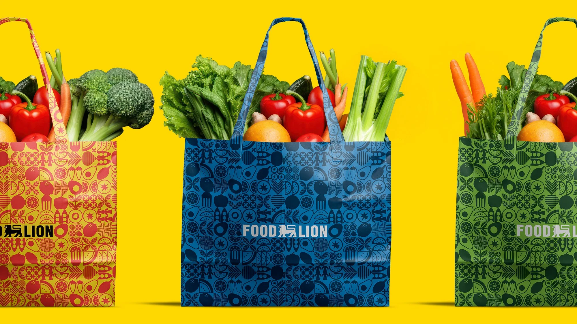
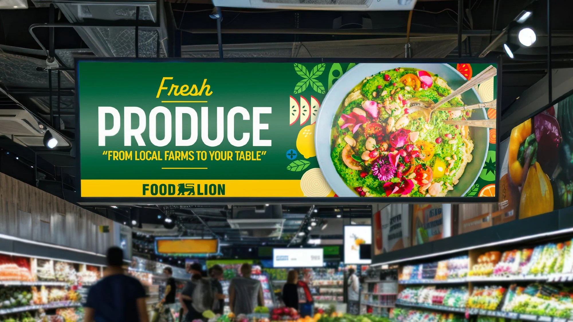
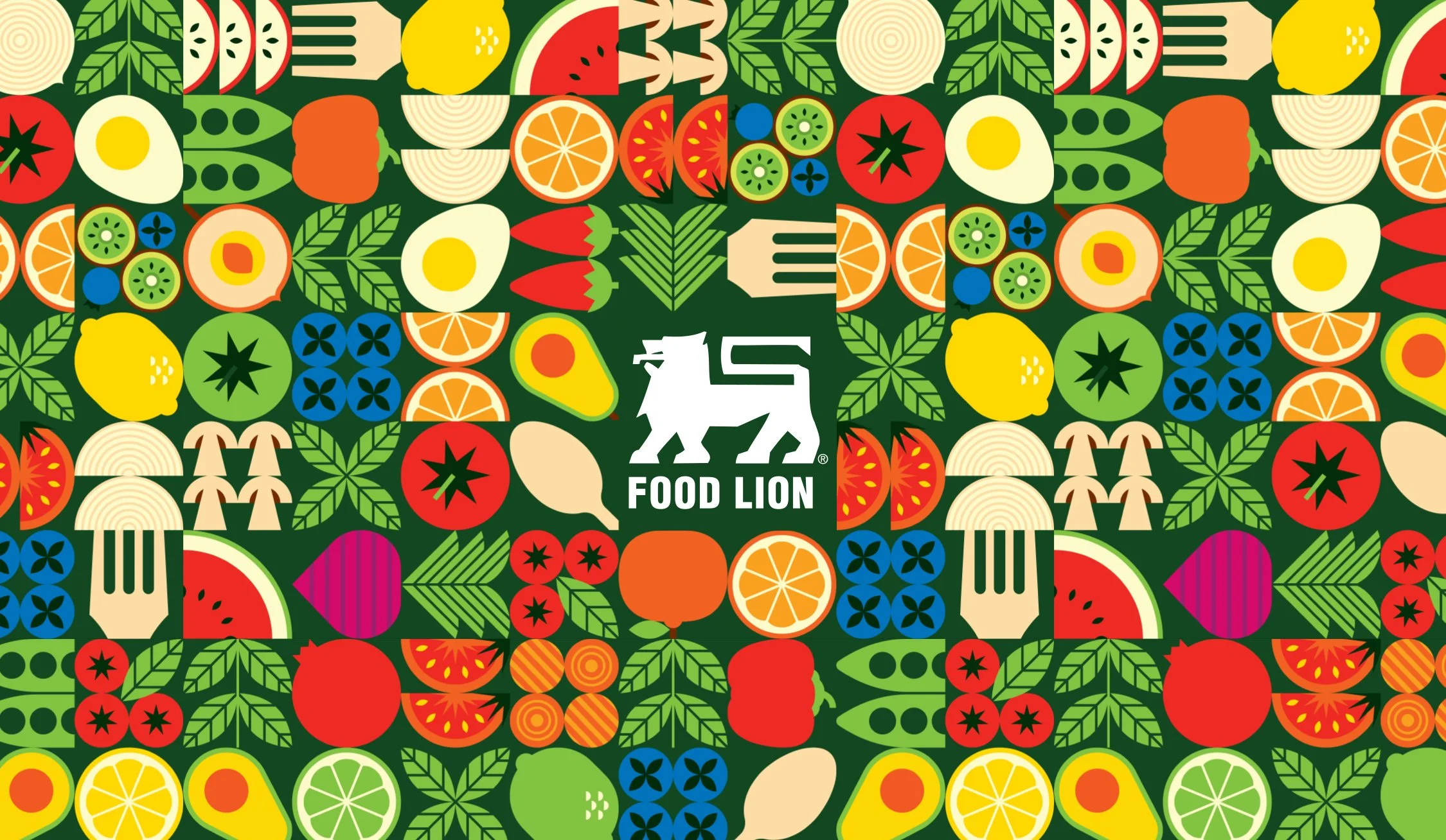
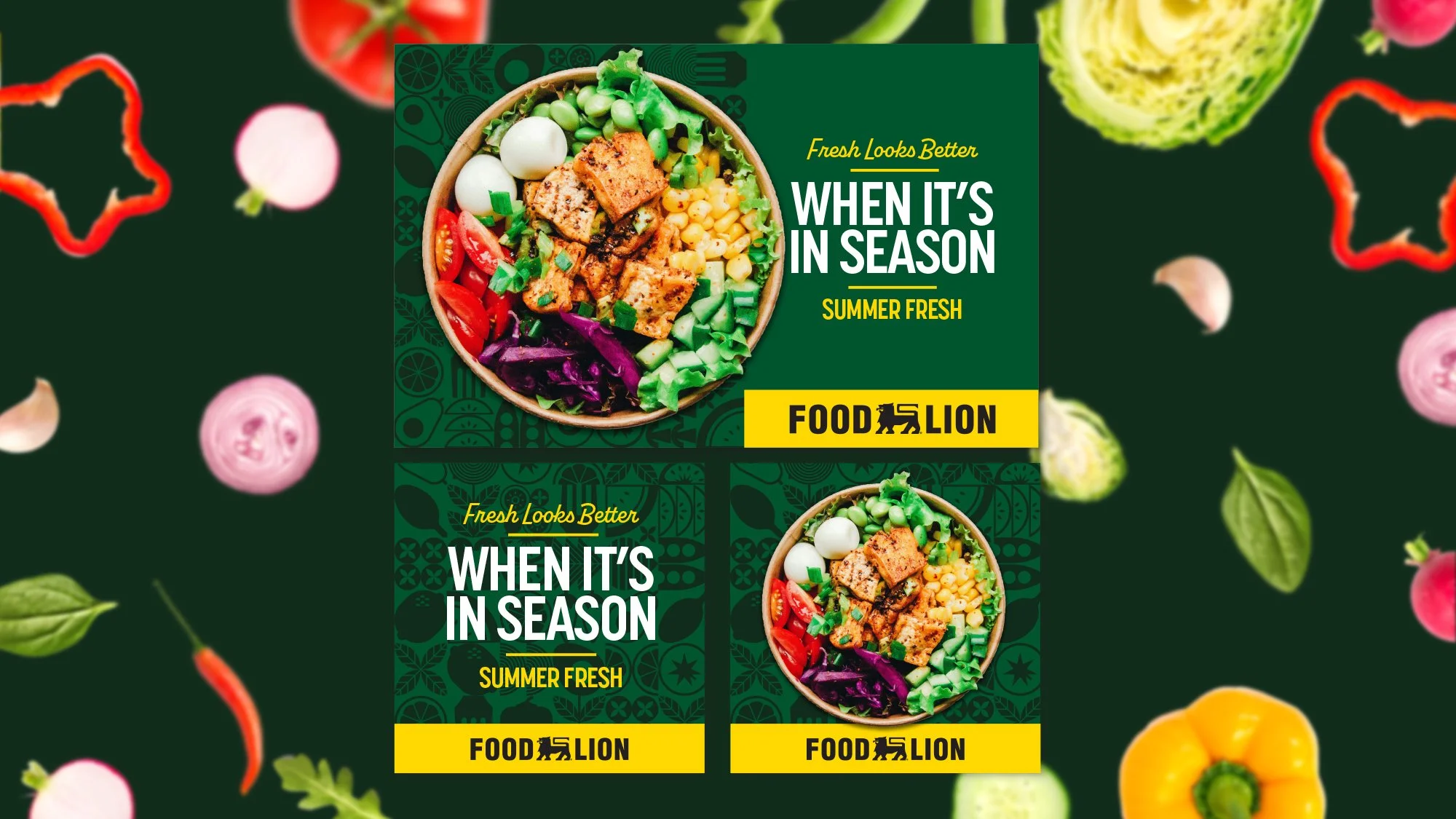
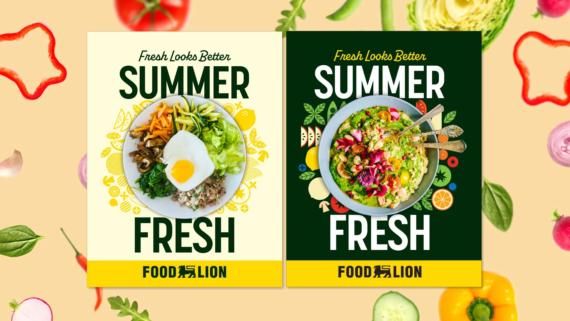
This exploration reimagines Food Lion’s visual language through a farm-to-table lens, putting fresh ingredients front and center. Open, modular graphics were designed to feel approachable, ownable, and flexible across in-store advertising, digital, and social media. The result is a cohesive system built for clarity, consistency, and long-term scalability.
A Fresh-First Brand System
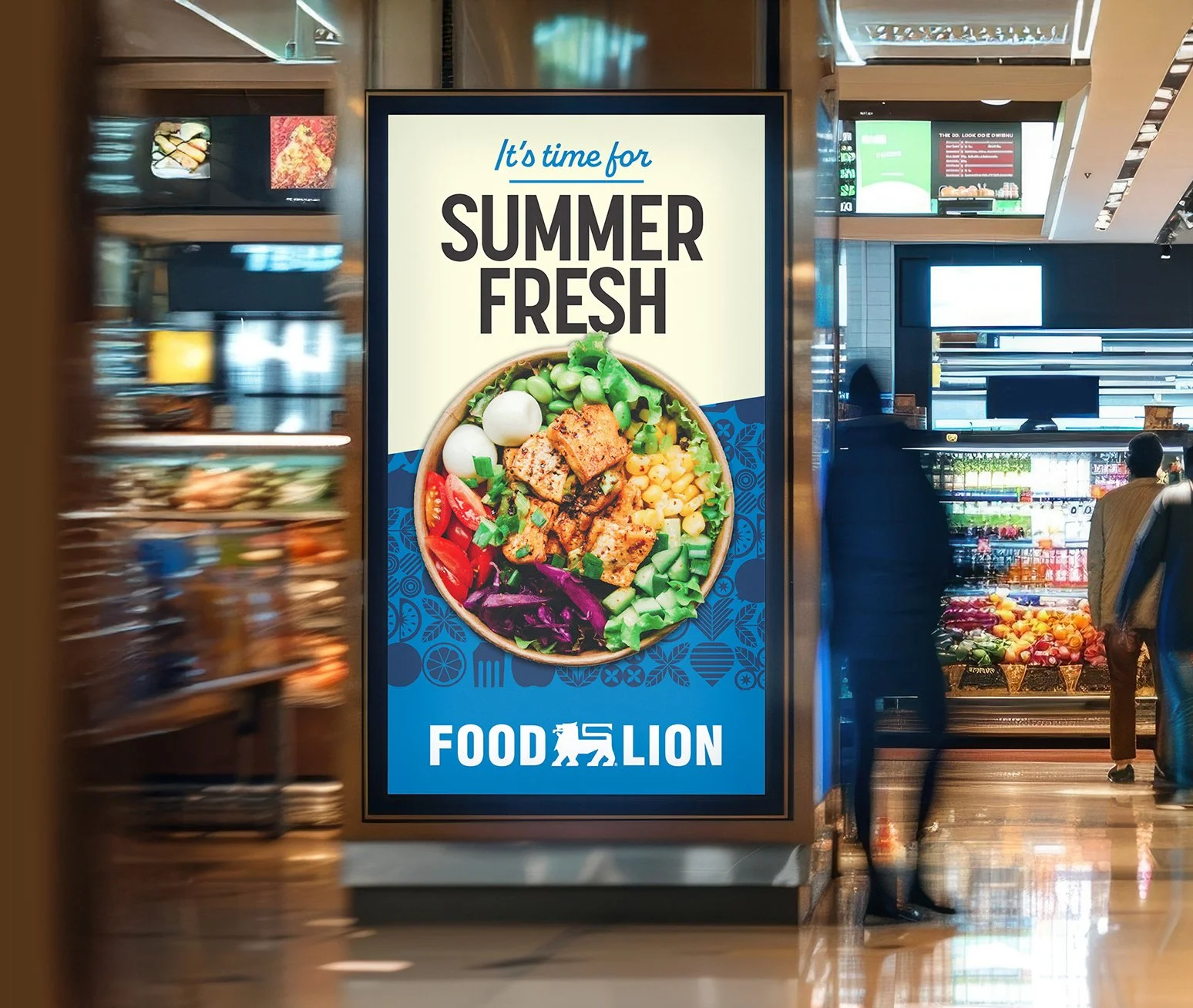
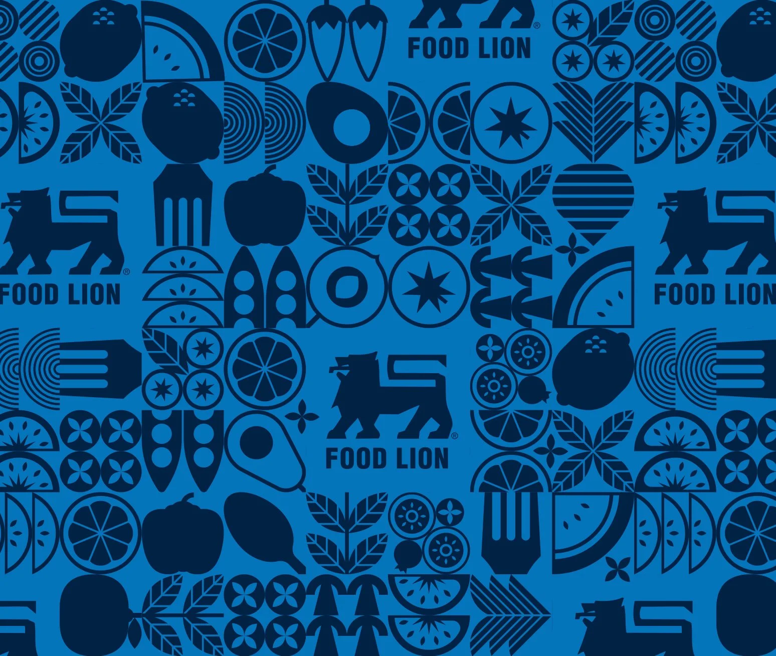
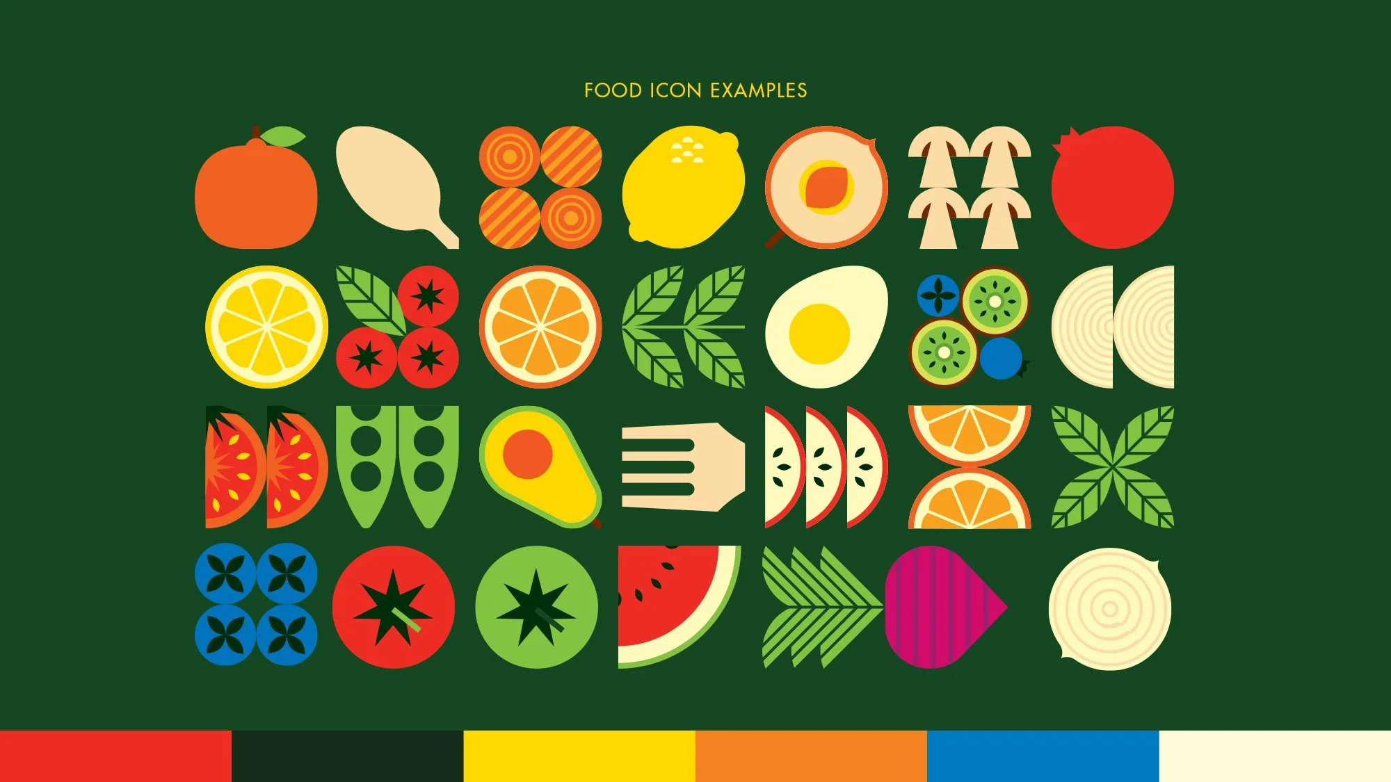

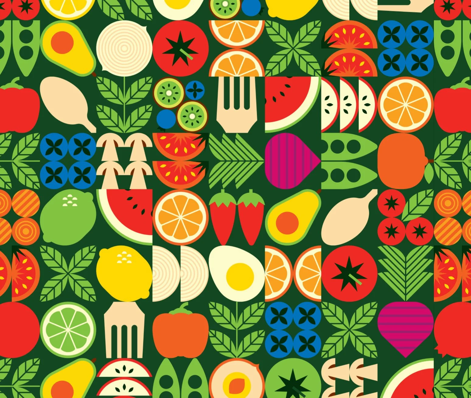
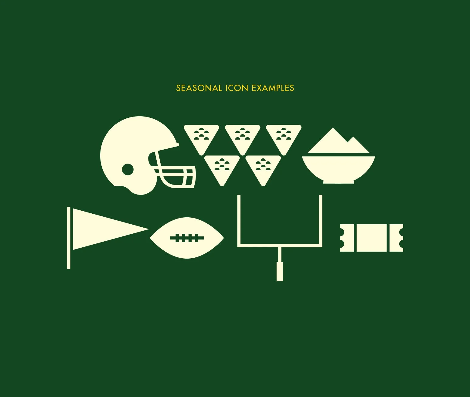
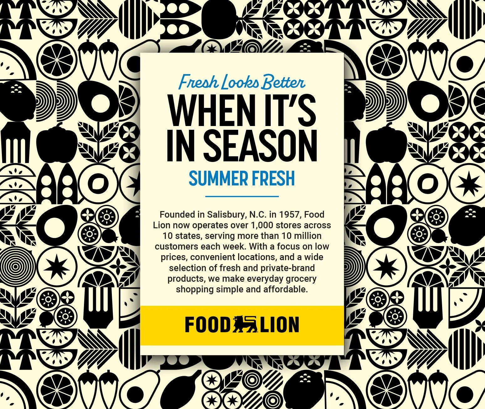
Built to adapt across screen sizes, the system prioritizes food and community through bold, image-led layouts. A modular icon system flexes seamlessly across placements, maintaining clarity and consistency at every scale.
Built to Scale

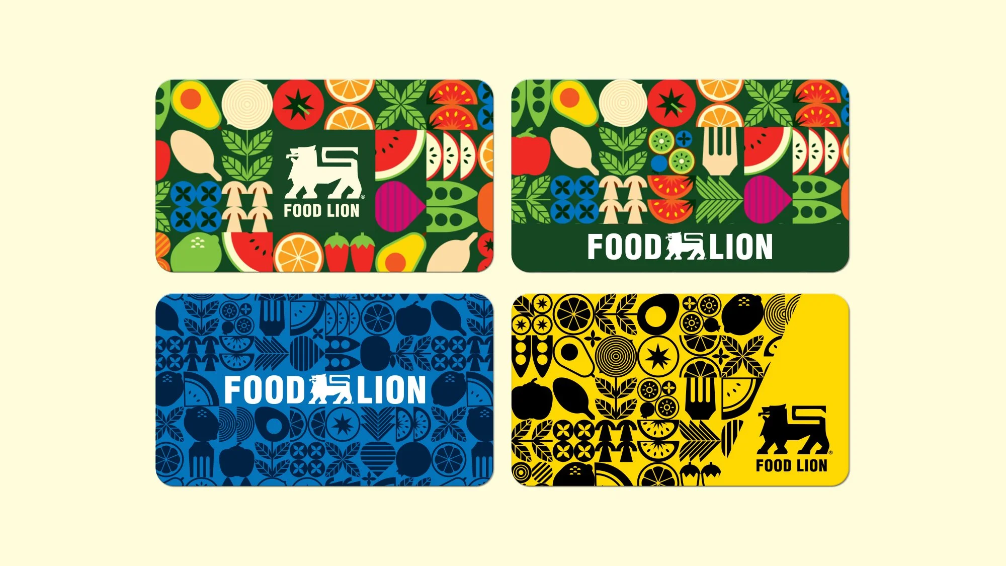
The MVP loyalty card applies the fresh-first visual system to a core customer utility. Ingredient-led icons and bold brand marks create a clear, recognizable design that feels consistent with the larger system.
Designed for Loyalty
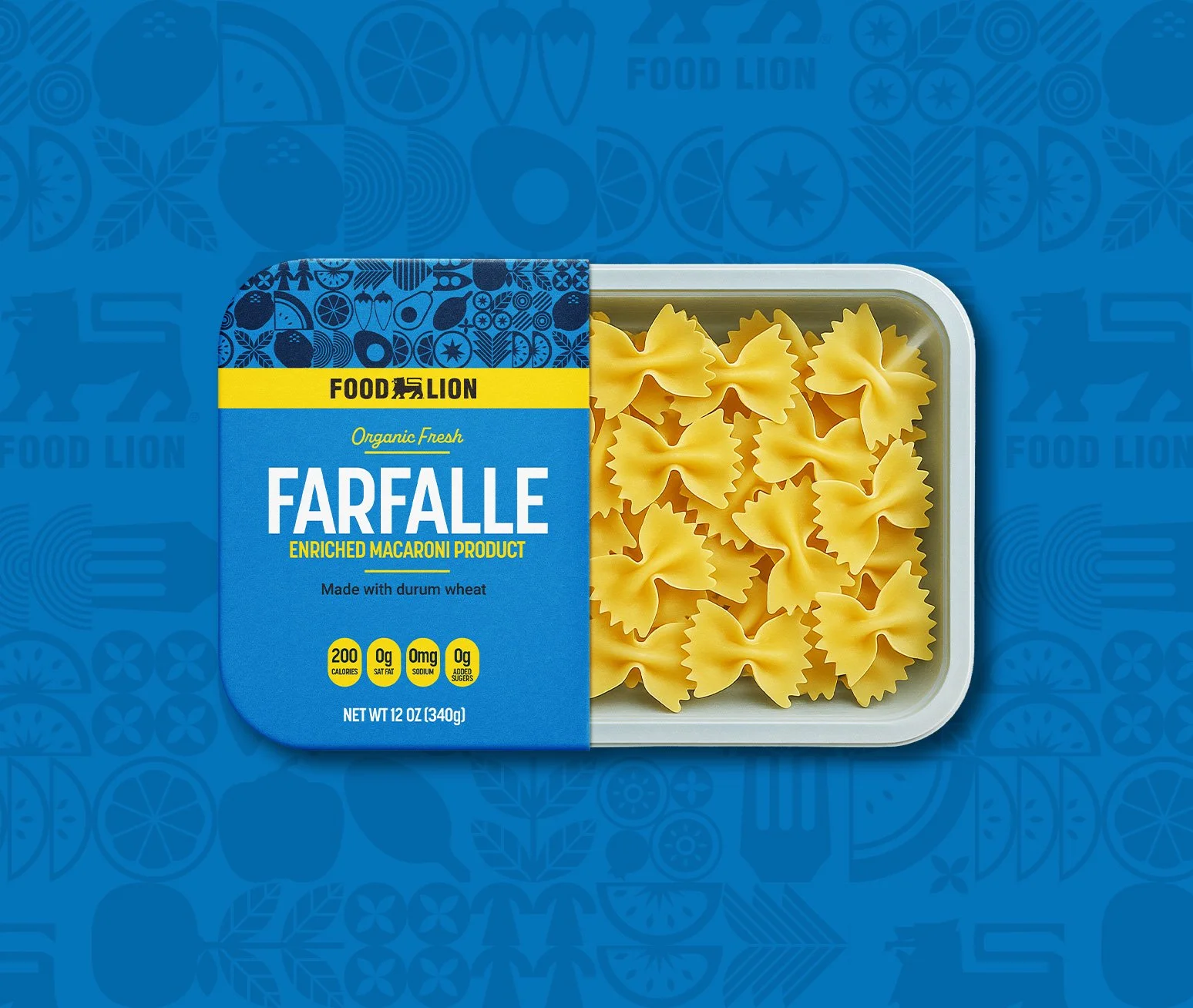
The design system translates naturally into in-store packaging through modular graphics and food-forward visuals. Built for clarity and consistency, the approach ensures strong shelf impact while remaining adaptable at scale.
A System Built for the Shelf